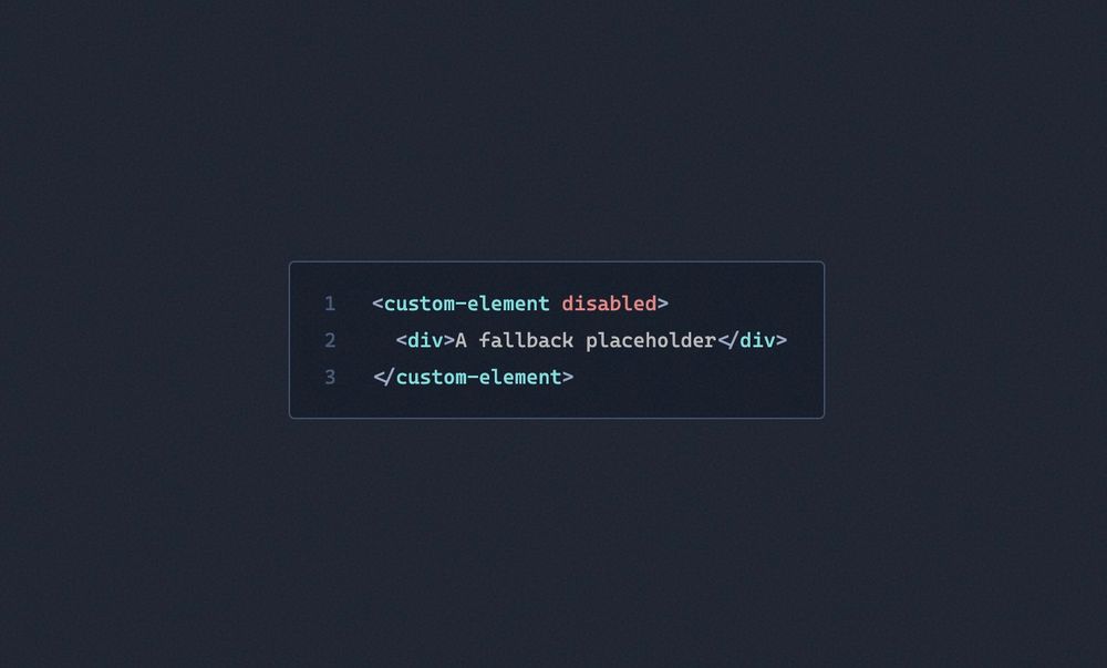
Optional web components
Custom elements are great! They provide a way of building reusable (or not) pieces of interface that will stay solid over time. Being a web standard brings a certain peace of mind when using them. On top of that, total control can be achieved over the level of isolation they need from the parent app or website.
However, given that a good amount of people are walking around with JavaScript fully disabled, your website shouldn't rely on it for critical UI parts.
My remarks are not aimed at complex web apps or UX parts that could never work without JS enabled: this isn't what is targeted here.
A right-fitting use case #
This website exposes a <theme-selector /> in the sticky navigation. This selector is a web component displaying a simple select with the following 3 options:
- Auto = system theme
- Light = forced light theme
- Dark = forced dark theme
The default option being "auto", this website will automatically sync with the visitor's system theme. Once the component is loaded, it detects if the user has already chosen a theme, in which case their choice will be stored in window.localStorage, then applies it. But what happens if the user has disabled JS?
Simply nothing.
In case JavaScript is never executed, the website is only synced with the system theme. Nothing indicating this information is shown to the user, and that's too bad.
Progressive enhancement #
I found that the best way to reconcile this web component with a version of this website served without JavaScript was to initialize it this way:
<theme-selector
  class=":btn"
  aria-label="Theme (needs JS)"
  data-tooltip
  disabled
>
  <button>Auto </button>
</theme-selector>
<theme-selector /> now has a button as a child displaying a default value. It also has an aria-label showing a "Needs JS" message when hovered and is also disabled at the start. The web component handles styles with its class attribute; that way it will be displayed correctly with or without JS.
Now, if JS is allowed to run, the web component will replace its innerHTML with a shadow root containing a select with the three possible options.
The web component will also update the aria-label and remove the disabled attribute in its connectedCallback:
connectedCallback() {
  this.setAttribute("aria-label", "Change theme");
  this.removeAttribute("disabled");
  /* ... */
}
This approach brings two main benefits:
- A disabled theme selector is still displayed, showing a tooltip indicating it needs JS to work correctly.
- A placeholder is displayed in case
theme-selector.jsis loaded over a really slow network, preventing a layout shift.
Another example #
In a simpler use case, like this animated demo, a fallback image is displayed in case JavaScript is not enabled:
<simple-bar-demo playing="true">
  <noscript>
    <img
      class="introduction__image"
      src="/public/images/toolbox/simple-bar/preview.jpg"
      alt="simple-bar demo"
    />
  </noscript>
</simple-bar-demo>
Here, the noscript tag is important, as without it, the fallback image would start to load immediately before the <simple-bar-demo /> web component is fully loaded. It is needed in order to prevent unnecessary asset loading.
There are surely more applications than I can think of!